
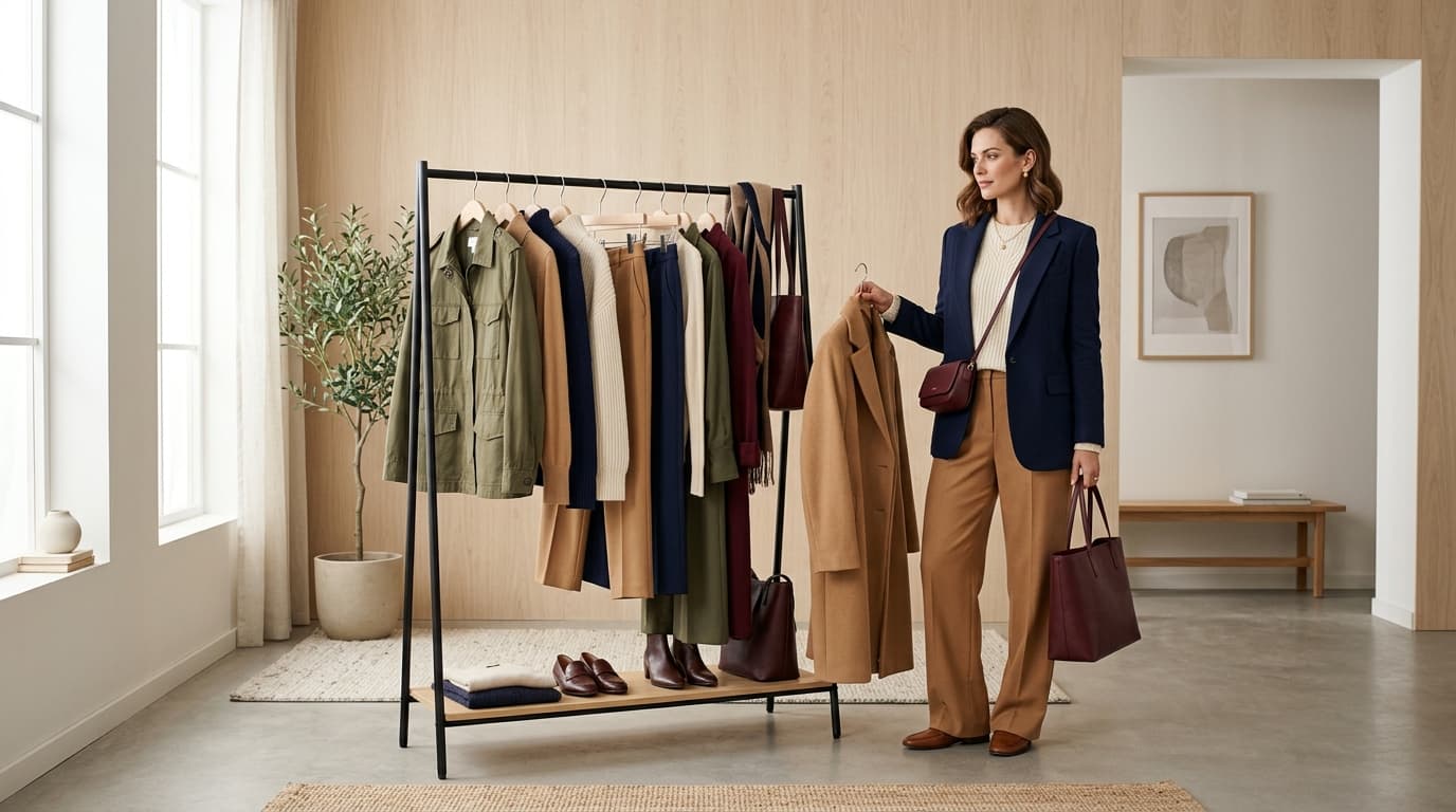
Two outfits can use nearly identical pieces and read completely differently, and the difference usually comes down to color. Get it right and an outfit looks deliberate. Get it wrong and even well-fitting, expensive pieces can look accidental.
Color pairing is not intuition. It is a small set of relationships, mapped centuries ago on a color wheel, that reliably produce combinations that work. This guide covers those relationships, how to use neutrals, and how to adjust color choices by occasion.
TL;DR
Colors that go together fall into a few reliable categories: analogous (neighbors on the wheel), complementary (opposites), and neutral-anchored combinations. Most outfits work best limited to two or three colors total. Slidez lets you try any color combination on your own body through virtual try-on, so you can confirm it works before committing.
What Colors Go Together in an Outfit?
Colors go together in an outfit when they share a consistent relationship on the color wheel: close neighbors, direct opposites, or a bold color anchored by neutrals, generally limited to two or three colors total.
Almost every combination that reads as "put together" fits one of a handful of patterns. Learning those patterns replaces guesswork with a repeatable method.
Analogous combinations use colors that sit next to each other on the wheel, like blue and teal, or red and orange. These are the easiest combinations to get right, because the colors share an undertone and rarely clash.
Complementary combinations use colors directly opposite each other, like blue and orange, or red and green. These create deliberate, high-contrast pairings that read as confident when balanced correctly.
Neutral-anchored combinations pair one or two statement colors with neutrals like black, white, grey, navy, or beige, which is the most flexible and forgiving structure available. As color consultants at House of Colour explain, neutrals provide a flexible foundation for an outfit, allowing one stronger color to stand out while keeping the overall combination balanced.
How to Use the Color Wheel for Clothing
The color wheel is a simple tool, and most of its value comes from three specific relationship types.
Analogous colors sit within about 60 degrees of each other on the wheel. A navy top with a teal skirt, or a burgundy jacket with a rust-toned scarf, both work because the colors share a family resemblance.
Complementary colors sit directly opposite each other. Blue and orange, red and green, purple and yellow. Full-strength complementary pairing can be intense, so most outfits use one color at full saturation and the other as an accent rather than an equal partner.
Triadic combinations use three colors evenly spaced around the wheel, like red, yellow, and blue. These are the hardest to pull off in clothing and generally work best with one dominant color and the other two used sparingly, in accessories rather than major pieces.
Monochromatic combinations use different shades and tones of a single color. As Vogue highlights in its guide to color theory for clothing, a monochromatic outfit uses different shades of one color, making it a simple way to create a cohesive look while still adding depth through texture and tone. A navy, mid-blue, and pale blue outfit reads as intentional, making it one of the most reliable structures for anyone still building color confidence.
A practical way to use the wheel: pick your dominant color, then look directly across for a complementary accent, or immediately beside it for an analogous one.
Best Color Combinations for Outfits
A few pairings come up repeatedly because they work reliably across most skin tones, occasions, and personal styles.
Navy and white. Classic, crisp, works for almost any formality level.
Black and camel. Sophisticated and easy, a staple combination in tailored dressing.
Burgundy and olive. Two muted, earthy tones that share enough warmth to coordinate without clashing.
Blush and grey. Soft and balanced, a gentle version of a complementary pairing.
Denim blue and white. Effortless and close to foolproof, particularly for casual dressing.
Mustard and navy. A bolder complementary pairing that reads as confident without being loud.
All black. A monochromatic default that works because there is nothing to clash.
Emerald and gold. A rich, jewel-toned pairing that leans formal and works well for evening occasions.
These are starting points, not a ceiling. Once you understand why they work, you can build your own combinations using the same underlying logic.
How to Match Colors With Neutral Clothes
Neutrals do most of the structural work in a coordinated wardrobe, and understanding how to use them properly makes every other color decision easier.
Neutrals extend any palette. Black, white, grey, navy, beige, and camel all pair with nearly every other color, which is why a neutral-heavy wardrobe is the fastest route to combinations that consistently work.
Not all neutrals are interchangeable. Neutrals have undertones too: cream and camel generally lean warm, while pure white and charcoal usually lean cool. As House of Colour notes, considering those undertones can help an outfit feel more coordinated. Rather than an outright clash, mixing warm and cool neutrals without intention can sometimes create subtle visual tension, whereas matching undertones creates an effortless, harmonious balance across pieces.
Use a neutral as the majority, color as the accent. An outfit that is roughly 70 to 80 percent neutral, with one confident color as the focal point, is one of the most reliable formulas available.
Two neutrals plus one color is a dependable structure. A navy top, beige trousers, and a single colored accessory or shoe covers most everyday situations without requiring much thought.
For more on proportion and general matching principles, see our guide on how to match clothes like a professional stylist.
How to Choose Outfit Colors for Different Occasions
Color choice shifts with context, and matching that context is part of getting a color combination right.
Work. Navy, grey, black, and white form a safe, professional base. Add one considered color accent through a blouse, tie, or accessory rather than multiple bold pieces.
Formal events. Jewel tones (emerald, sapphire, burgundy) and classic black or navy read as elevated. Metallics work well as accents at this level of formality.
Casual and everyday. More room to experiment. Analogous pairings and denim-based neutral combinations both work well here.
Weddings as a guest. Softer, complementary pairings tend to photograph and read well, while avoiding anything close to white or overly attention-grabbing relative to the couple.
Summer. Lighter values of any color family read as seasonally appropriate. Pastel versions of complementary pairs work particularly well.
Winter. Deeper, richer saturations of the same color relationships used year-round tend to feel more seasonally correct.
For more detail on dress codes themselves, see our guide on what to wear for every occasion.
Common Color-Matching Mistakes to Avoid
A handful of recurring mistakes account for most color combinations that do not quite work.
Using too many colors at once. More than three colors in one outfit is difficult to coordinate without looking chaotic. Two or three is the reliable range.
Pairing colors of mismatched intensity. Colors that work together by hue can still feel unbalanced when their saturation levels are very different. According to research published in Frontiers in Artificial Intelligence and Applications, perceived color harmony is heavily influenced by saturation and intensity alongside hue, with harmonious palettes commonly maintaining moderate saturation and intensity. A muted olive next to a neon yellow can feel discordant not because the colors are universally wrong, but because stark differences in intensity compete for visual attention. While high-contrast saturation can work as an intentional statement, matching intensity levels generally produces an easier sense of balance.
Mixing warm and cool neutrals unintentionally. A cream sweater with cool charcoal or grey trousers can feel slightly disconnected if worn without an intentional bridge, because their undertones lean in opposite temperature directions. While warm and cool neutrals can be paired creatively, being mindful of their temperatures helps keep the combination feeling deliberate rather than accidental.
Ignoring proportion of color. Splitting an outfit exactly 50/50 between two bold colors tends to look less intentional than a clear majority-minority relationship.
Judging color under poor lighting. Store lighting and screens both distort color. Confirm a combination in natural daylight before deciding it does not work.
Avoiding color entirely out of uncertainty. Defaulting to black or grey because a combination feels risky means missing color relationships that would genuinely work. Testing beats avoiding.
Conclusion
Colors that go together in an outfit follow a small number of reliable relationships: analogous neighbors, complementary opposites, and neutral-anchored pairings, generally kept to two or three colors total. Once those patterns are familiar, color stops being a guessing game.
Slidez makes testing a combination effortless. Try any pairing on your own body through virtual try-on before committing to it, whether it is a new purchase or a combination of pieces you already own. The free version includes all core features.
Ready to see your color combinations on yourself? 👉 Download Slidez free.
Frequently Asked Questions (FAQs)
What are the best color combinations for clothes?
Reliable combinations include navy and white, black and camel, burgundy and olive, and denim blue and white. More broadly, colors that sit near each other on the color wheel (analogous) or directly opposite each other (complementary) tend to pair well.
Neutral-anchored combinations, one bold color paired with black, white, grey, or beige, are the most forgiving structure for building confidence with color.
How do I match colors in an outfit?
Start by picking one dominant color, then choose either a neighboring color on the wheel for a subtle, harmonious look, or an opposite color for a bolder, more deliberate contrast. Keep the total number of colors to two or three.
Use neutrals to extend either approach. A neutral base with one confident color accent is one of the most reliable formulas for a coordinated outfit.
What colors should not be worn together?
There is no strict universal ban, but a few combinations are harder to pull off: colors of very different saturation (a muted tone next to a neon one), or mismatched warm and cool neutrals worn together, since their underlying undertones can pull in different directions.
These are tendencies rather than rules. Confidence and styling can make almost any combination work if the rest of the outfit supports it.
How many colors should you wear in one outfit?
Two or three colors is the generally reliable range. One additional color kept to a small accent, like a shoe or accessory, is usually fine, but four or more competing colors becomes difficult to coordinate without looking chaotic.
Monochromatic outfits, built from shades of a single color, are an exception and can work well as a fourth option beyond the two-or-three-color guideline.
What neutral colors go with everything?
Black, white, grey, navy, and beige all function as near-universal neutrals that extend almost any color palette. Camel and chocolate brown work similarly well within warmer color schemes.
Because not all neutrals share the same undertone, pairing a warm neutral with warm colors and a cool neutral with cool colors produces a more polished result than mixing them.
Can AI help me choose outfit color combinations?
Yes. AI styling tools can evaluate color relationships automatically and factor in your existing wardrobe, so recommendations tend toward combinations that genuinely coordinate.
Slidez also lets you try color combinations on your own body through virtual try-on, which is the most reliable way to confirm a pairing works before committing to it.
Want to see a color combination on yourself before you commit? 👉 Download Slidez free.
References
- How to Wear Neutrals With Style, House of Colour, September 2018
- How to Master Color Theory in Clothing Like a Vogue Fashion Editor, Vogue, July 2026
- How to Wear Neutrals With Style (Warm vs. Cool Undertones), House of Colour, September 2018
- Towards a Universal Understanding of Color Harmony: Fuzzy Approach, Frontiers in Artificial Intelligence and Applications, 2023